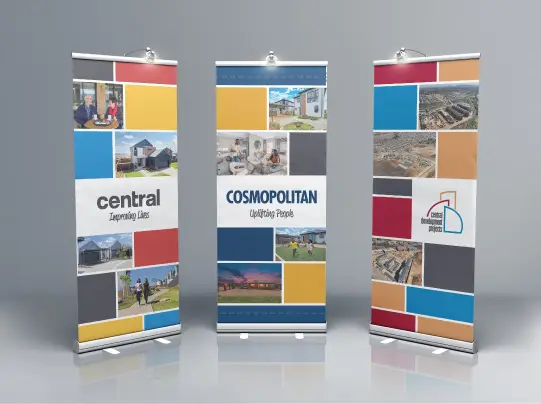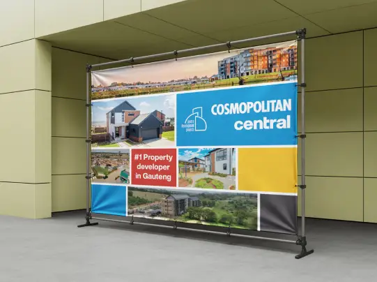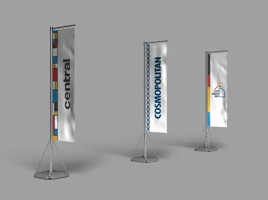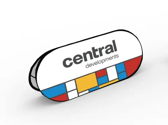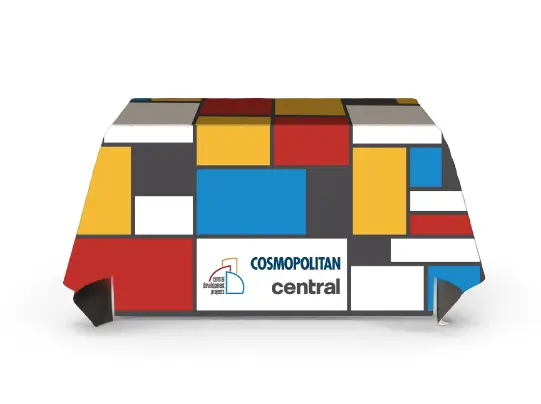

The challenge was to unify three distinct corporate brands into a single visual system that could be applied consistently across multiple marketing touchpoints without compromising each brand's identity.
I developed a range of marketing materials for Central Developments, Cosmopolitan Projects, and Central Developments Projects—three divisions operating under one corporate group. The objective was to create a cohesive visual language that strengthened the group's overall brand presence while allowing each division to maintain its unique identity.
A significant challenge was that only two of the three divisions had established brand guidelines, while the third had no formal visual standards. To address this, I analysed the existing brand guides to identify common design principles, including typography, colour relationships, layout structure, spacing, and visual hierarchy. These shared elements formed the foundation of a flexible design system that could be applied consistently across all three brands.
By carefully integrating design elements from the existing brand identities, I established a unified visual framework that allowed the third division to fit naturally within the group while retaining its own distinct character. The result was a professional, scalable design system that improved brand consistency, reinforced the relationship between the three divisions, and created a cohesive presence across all event collateral and marketing materials.
Outcome: A unified visual identity that successfully aligned three corporate brands through consistent layouts, typography, hierarchy, and modular design, strengthening the overall group brand while preserving the individuality of each division.